
A logo you can actually use, in every format you need.
A mark drawn properly and delivered as a working set: every lockup, every format, the sizes it stops working at, and the rules for using it.
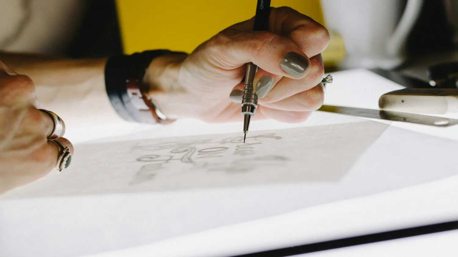
- Typical length
- Four to six weeks
- Routes shown
- Three
- Ends with
- Files and rules
What you are actually buying
A logo is used at eighteen millimetres on a business card and across a six-metre stand. It appears on white, on photographs, on a dark app icon and embroidered on a shirt. A file that works in one of those places and fails in the others is not finished, and most of the logos we are asked to fix failed on exactly that.
So the work is drawing the mark and then proving it. We test it small, in one colour, reversed out, on the worst background it will realistically sit on, and at the size where it stops being legible. Where it breaks, we draw the version that does not break, which is why the delivery is a set of files, one for each place it has to work.
Three routes come back, each with the reasoning. We say which we would choose. What we will not do is present a wall of options and let you pick, because that is a way of avoiding the recommendation you are paying for.
This page is the smaller of two things you might want. If the question is broader than the mark, and it usually is, brand identity design is the honest answer and we will say so on the first call, before taking the brief.
Scope
What is included
Discovery and reference
What the mark has to do, where it will be used, and what the category already looks like. A logo that resembles three competitors is a research failure before it is a drawing failure.
Three routes, drawn
Each genuinely different, each shown in the places it will be used, never floating on a white square, and each with the argument for it written down.
Refinement
Three rounds on the chosen route: proportion, spacing, weight and the optical corrections that make a mark sit right, which is a different thing from measuring right.
The lockup set
Horizontal, stacked, icon-only and responsive versions, plus the co-branding lockups if you need them, all built on the same construction.
Every format
Vector masters, and exports for print, screen, social, favicon and app icon. CMYK, RGB, Pantone and one-colour versions, named so a printer knows which to use.
Usage rules
Clear space, minimum sizes, approved colourways, the backgrounds it may sit on and the things people will otherwise do to it. Short enough that somebody reads it.
How it runs
Week one
Discovery and a category audit. We agree where the mark has to work, what it has to sit beside, and what it must avoid resembling. You approve that before drawing starts.
Weeks two to four
Three routes drawn and shown in context, with our recommendation. You choose one and we refine it over three rounds, testing it small, reversed and in one colour as we go.
Weeks five and six
The full lockup set built, every format exported and named, and the usage rules written. Handover includes the vector masters, so any designer you work with afterwards has what they need.
What you get
- Vector master artwork in AI, EPS, SVG and PDF
- Horizontal, stacked, icon-only and responsive lockups
- Colour, one-colour, reversed and mono versions
- PNG and JPEG exports at the sizes you will actually use, plus favicon and app icon
- A short usage sheet: clear space, minimum sizes and approved colourways
How it is judged
- Whether it holds at the smallest size you use it
- Whether it survives one colour and reversed out
- Whether anybody has to ask us for a file afterwards
- Whether it is distinct from the marks it will sit beside
Questions we get asked
How much does a logo cost?
How many revisions do we get?
Do we own the logo?
Can you help us trademark it?
What if none of the three routes works?
Do we need a full identity as well?
Next
Tell us where the mark has to work
Send us the places the logo will appear: the sign, the pack, the app, the shirt, the stand. That list decides more about the drawing than any adjective in a brief, and it is where we start.
Related services
The work behind this