An identity system your team can actually apply.
The decisions about how a company looks, sounds and behaves, made once and built into a system your own team can apply without asking us.
- Typical length
- Eight to twelve weeks
- Routes shown
- Two or three
- Ends with
- A system in use
What a brand identity actually is
It is the set of decisions that make a company recognisable before anybody reads a word: the mark, the typefaces, the colour, the way photographs are chosen and cropped, the grid a layout sits on, and the tone the writing takes. Each of those is a decision somebody is making today, one job at a time, usually a different person each time.
The identity is not the logo. The logo is one component, and the smallest one. What decides whether a company looks like itself across a stand, a pack, a deck and a website is everything around the logo, and that is the part most identity projects underinvest in.
We work through the decisions in the order that makes them cheap. What the brand has to do commercially comes first, then two or three routes with the reasoning attached, then the chosen route developed into the components you actually use. You see the routes before they are finished, because arguing at that stage costs a week and arguing at the end costs the project.
The measure of the work is whether it holds up when we are not there. Six months after handover, either your team is producing material that looks like the company, or they are working around a system that was too rigid or too vague to use. That is the outcome we design for, and it is why the handover is templates and source files, where a document of rules would sit unread.
Scope
What is included
Brand strategy and positioning
What the company is for, who it is for and what it says that competitors cannot. Everything visual afterwards is an argument in service of this, and skipping it is how identities end up being decided by taste.
The identity system
Primary and secondary marks, a typeface hierarchy, a colour system with the accessible pairings worked out, an icon set, and the grid every layout sits on.
Art direction for photography
How pictures get chosen, shot and cropped, with a reference set your team can match against. This is the component that goes wrong fastest and the one guidelines usually cover in one line.
Tone of voice
How the company writes, with real examples rewritten from your own material. Invented ones prove nothing. Three words on a page saying bold, human and confident is not a tone of voice.
Applications
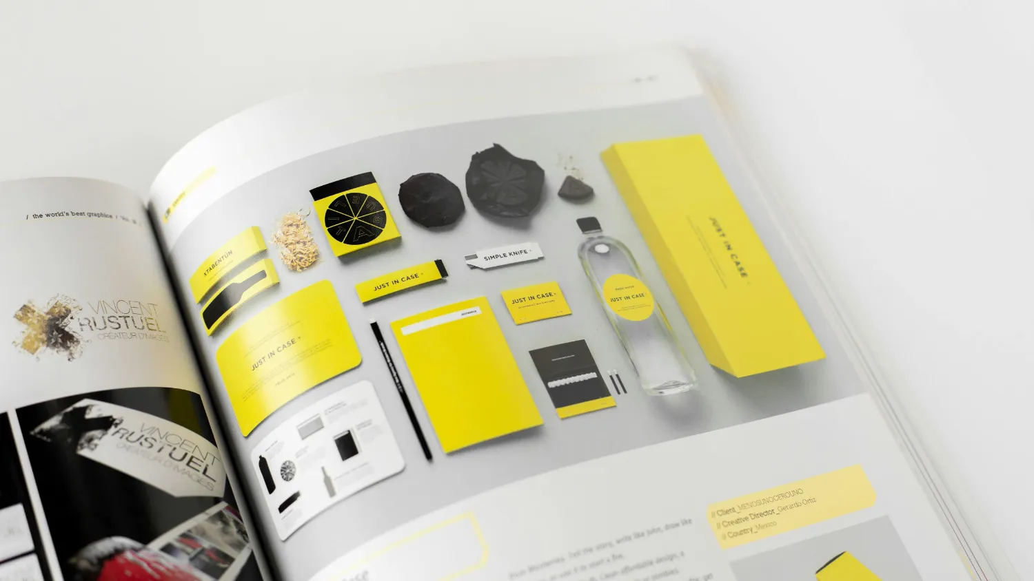
The things you actually make: stationery, decks, social templates, signage, stand graphics, packaging shells and web components, built so the system is proven before it is handed over.
Guidelines and handover
Written guidelines, every source file, and working templates in the software your team uses. Plus a working session so the people who will apply it have used it once with us in the room.
How it runs
Weeks one to three
Discovery. We interview your team and your customers, audit everything the company currently puts out, and agree in writing what the identity has to achieve commercially before anybody opens a design file.
Weeks four to eight
Two or three routes, each with the thinking attached and a recommendation from us. The chosen route is then developed into the full system, with three rounds of revision at each stage and the applications built alongside it.
Weeks nine to twelve
Guidelines written, source files and templates prepared, and a working session with the people who will use it. We stay available through the first months of real application, which is when a system either holds or quietly falls apart.
What you get
- Primary, secondary and responsive versions of the mark, in every format
- A typeface hierarchy and licences guidance, with the fallbacks specified
- A colour system with accessible pairings and the values for screen and print
- Art direction reference and a tone of voice with worked examples
- Editable templates for decks, documents, social and signage
- Written guidelines and every source file, owned outright by you
How it is judged
- Whether your team can produce on-brand material without us
- Whether the company is recognisable across channels a buyer meets it in
- How much time is no longer spent re-deciding settled questions
- Whether new hires can find and apply the system on their first week
Questions we get asked
How long does a brand identity take?
Do we own everything at the end?
How many routes do we see?
Can you work with our existing logo?
What happens if our team cannot apply the system?
Do you do the rollout as well?
How is this different from a logo project?
Next
Show us what the company looks like today
Send us the last five things you published: a deck, a brochure, a social post, the website and anything printed. We come back with what they say about the company as a set, and where the system is missing.
Related services
The work behind this